Single Page Application got a greater popularity because of a Usage of Mobile.
Bootstrap is an open source tools for creating Web Application. Bootstrap was developed by Mark Otto and Jacob Thornton in August 2011.
Why to use Bootstrap?
Over the last few years, Bootstrap becomes a very popular Front end Framework. It uses HTML5, CSS3 and JavaScript. The Bootstrap framework is feature rich and gives several benefits to those using it.
1. Responsiveness
2. Easy to Use
3. Browser Compatibility
4. Development Speed

How to create First web page using Bootstrap?
1. Downloading and Installing Bootstrap:
You can download Bootstrap from the getbootstrap.com. There are Instructions for Installations are available. And which include source code and documentation.
Bootstrap download comes with a compressed file. Extract this and open it. It includes folders named,
1. CSS files
2. JavaScript files
2. Creating Bootstrap Page:
You can start it with creating a HTML. For that you can use an Editor. Easiest way is to use a Template, you can download Templates from Bootstrap website.
Why to use Templates?
Because it is an easy way to start up. Template gives a readymade design , we just need to edit according to our requirements.
2. How to use Templates?
1. First step is to find out the best Template which can best describe your website.
2. Download that Template. After that Unzip that File. You will find,
1. Documentation folder which contains JS, assests and css file.
2. Theme folder which contains HTML pages.
3. Customize the Template using HTML, JavaScript and CSS. You can make changes according to your requirements.
3. Bootstrap Grid System:
Bootstrap Grid system allows up to 12 columns across the Page. This system is Responsive so it can automatically fit into any screen size. Grid system has a four classes.
1. xs (for phones)
2. sm (for tablets)
3. md (for desktop)
4. ld (for large desktop)
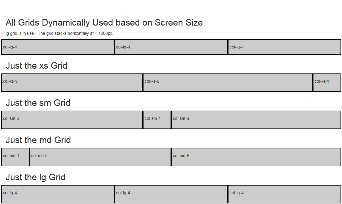
Each class come up with scales up, so if you wish to set the same widths for xs and sm, you only need to specify xs.
In a Grid System, Rows must be placed within the .container or .container-fluid for a best alignment.
Grid columns are created by specifying the number of 12 available columns as specified in above image, you wish to span.
There are a Predefined classes available including, .row and .col-sm-4 which can use for quickly making grid layouts.
There are lots of Grid Options are available like Grid Behavior, Container Width, class prefix, column width, gutter width.
4. Bootstrap Case:
It includes container, button, Menu, Navigation Bar.
1. Container:
We need to use all the HTML elements into the <body> inside the container.
<body>
<div class="container">
<h1>Bootstrap container example</h1>
<p>This is an Example.</p>
</div>
</body>
2. Buttons:
Button classes used <a> , <button> or <input> elements. It uses the classes like .btn-lg and .btn-info
<div class="button">
<h1>button example</h1>
<p>This is an Example. </p>
<a href="www.example.com" class="btn btn-info btn- lg">Button</a>
</div>
3. Navigation Bar:
Navigation bar can be expand or collapse using Bootstrap. Bootstrap provides a classes for Navigation like .navbar-default and .navbar-inverse.
<nav class="navbar navbar-inverse">
<div class="navbar-header">
<a class=" " href="#">Name</a>
</div>
In the process of learning the Single Page Application Using BootStrap framework, we have come to an end. Basically, we only summarized necessary basic informations, all the rest has done by Bootstrap framework. For more details visit KNOWARTH Technologies


This guide is a great reminder of why Bootstrap became so popular. Templates are such a time-saver, especially when you’re just getting started. I’ve used them as a base for projects that later grew into full mobile application development solutions, and the flexibility really helps.
ReplyDeleteI appreciate how clearly you explained the Bootstrap grid system—it makes responsive design feel less overwhelming. I first tried it while working on a project for mobile apps, and the flexibility across devices really stood out. Looking forward to seeing more real-world Bootstrap examples in your future posts.
ReplyDelete